Welcome to CodeCrew Infotech


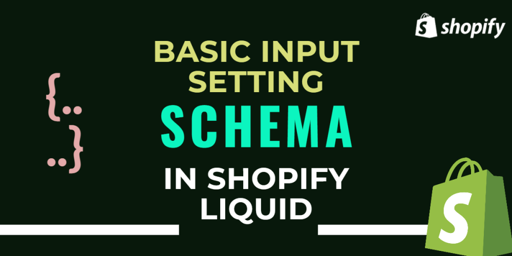
Basic Input Setting In Shopify
There are two types of input settings in Shopify
1) Basic input setting
2) Specializes in input setting
First, we see basic input types:
1. Checkbox
2. Number
3. Radio
4. Range
5. Select
6. Text
7. Textarea
Every input type has basic attributes like:
Type: which defines basic type or specialized type for example "type": checkbox"--> must be required attributes
Id: which is used in setting values for example "id": "show_announcement"--> must be required attributes
Label: The setting label, which you want to show in the theme editor.--> must be required attributes
Default: its default value for the setting.--> optional attributes
Info: An option for an informational text about the setting.--> optional attributes
1) Checkbox:
This type is for just one of the values if you want to show the announcement bar or not.
here we the schema of the checkbox is:
if you had the following setting implemented in each Liquid object:
|
{ "type": "checkbox", "id": "show_announcement", "label": "Show announcement", "default": true } |
Then the following Liquid would generate the following output in Section:
|
{{ section.settings.show_announcement }} |
Retrieve setting values by referencing the setting's unique id.
2) Number:
A setting of type number outputs a single number field.
|
{ "type": "number", "id": "products_per_page", "label": "Products per page", "default": 10 } |
Then the following Liquid would generate the following output in Section:
|
{{ section.settings.products_per_page }} |
Retrieve setting values by referencing the setting's unique id.
3) Radio:
These types are usually used when you want to select multi-options. such as alignment of header logo.
|
{ "type": "radio", "id": "logo_aligment", "label": "Logo alignment", "options": [ { "value": "left", "label": "Left" }, { "value": "centered", "label": "Centered" }, { "value": "right", "label": "Right" } ], "default": "left" } |
in the above example, you want to set the logo on the left or center, or right.
The following Liquid would generate the following output in Section:
|
{{ section.settings.logo_aligment }} |
Retrieve setting values by referencing the setting's unique id.
4) Range:
Define a range control (like a slider control):
let the user specify a numeric value which must be no less than a given value, and no more than another given value.
This is typically represented using a slider
Attributes of the range are:
min: minimum value of range --> must require
max: Maximum value of range --> must require
step: increment size of the number in slider --> must require
unit: The unit for the input.
|
{ "type": "range", "id": "font_size", "min": 0, "max": 20, "step": 1, "unit": "px", "label": "Font size", "default": 1 } |
The following Liquid would generate the following output in Section:
|
{{ section.settings.font_size }} |
Retrieve setting values by referencing the setting's unique id.
5) Select:
The select provides a menu of options.
using select you can also create drop-down menus so that users can select the value they want.
Attributes of selection are:
options: define each value in the drop-down menu --> must be required.
group: An optional attribute you can add to each option to create option groups in the drop-down.--> not required.
|
{ "type": "select", "id": "vertical_alignment", "label": "Vertical alignment", "options": [ { "value": "top", "label": "Top" }, { "value": "middle", "label": "Middle" }, { "value": "bottom", "label": "Bottom" } ], "default": "middle" } |
The following Liquid would generate the following output in Section:
|
{{ section.settings.vertical_alignment }} |
Retrieve setting values by referencing the setting's unique id.
6) Text:
Define a single-line text field that a user can enter text in.
Attributes:
Placeholder:
A placeholder value for the input.
|
{ "type": "text", "id": "footer_linklist_title", "label": "Heading", "default": "Quick links" } |
The following Liquid would generate the following output in Section:
|
{{ section.settings.footer_linklist_title }} |
Retrieve setting values by referencing the setting's unique id.
7) Textarea:
Define a multi-line text field that a user can enter text in.
Placeholder:
A placeholder value for the input.
|
{ "type": "textarea", "id": "home_welcome_message", "label": "Welcome message", "default": "Welcome to my shop!" } |
The following Liquid would generate the following output in Section:
|
{{ section.settings.home_welcome_message }} |
Retrieve setting values by referencing the setting's unique id.
You may also like