
Most browsers like Google Chrome, Safari, Firefox, Microsoft, and Brave offer developer tools that let you search into a website, including seeing how it looks on different devices.
With developer tools, you can quickly see how a website looks on different smartphones, tablets, and so on.
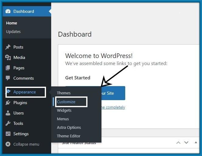
1. Using WordPress’s Theme Customizer:
Step 1: Click on Appearance > customize from the WordPress dashboard.
Step 2: This is a customizer. you can customize your page from the left-hand side option.
And then at the bottom of the Customizer is a hide control that sees your WordPress preview in 3 types (Desktop, Tablet, and Mobile view).
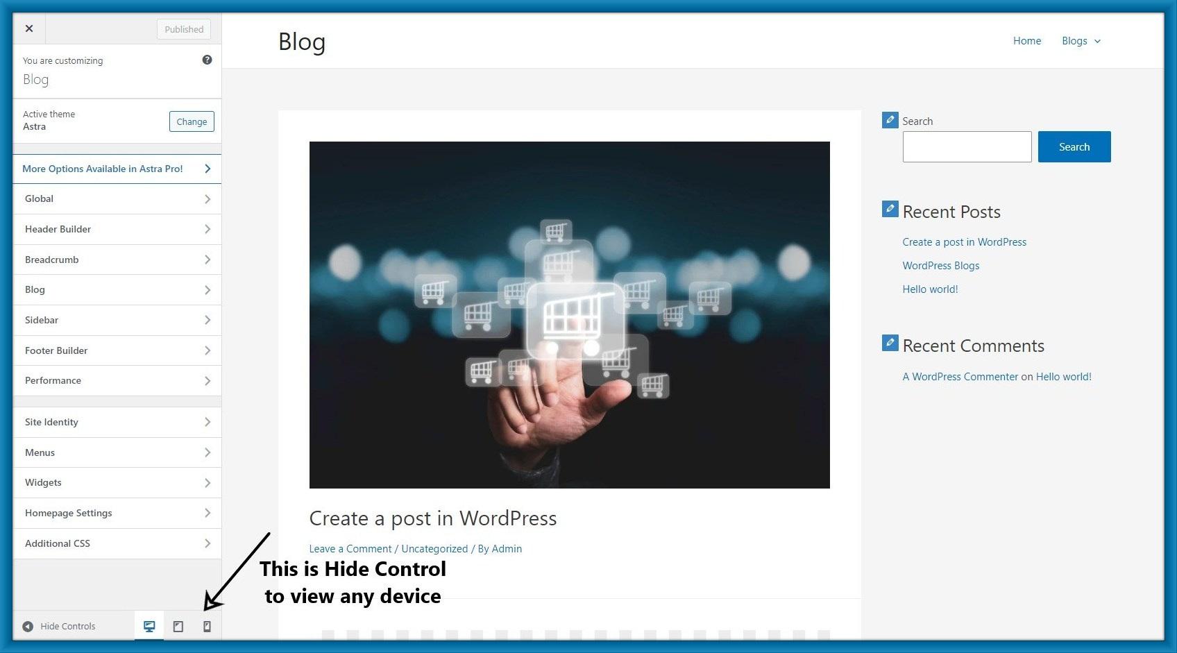
Step 3: Click On the mobile icon then you can see your site in mobile view.

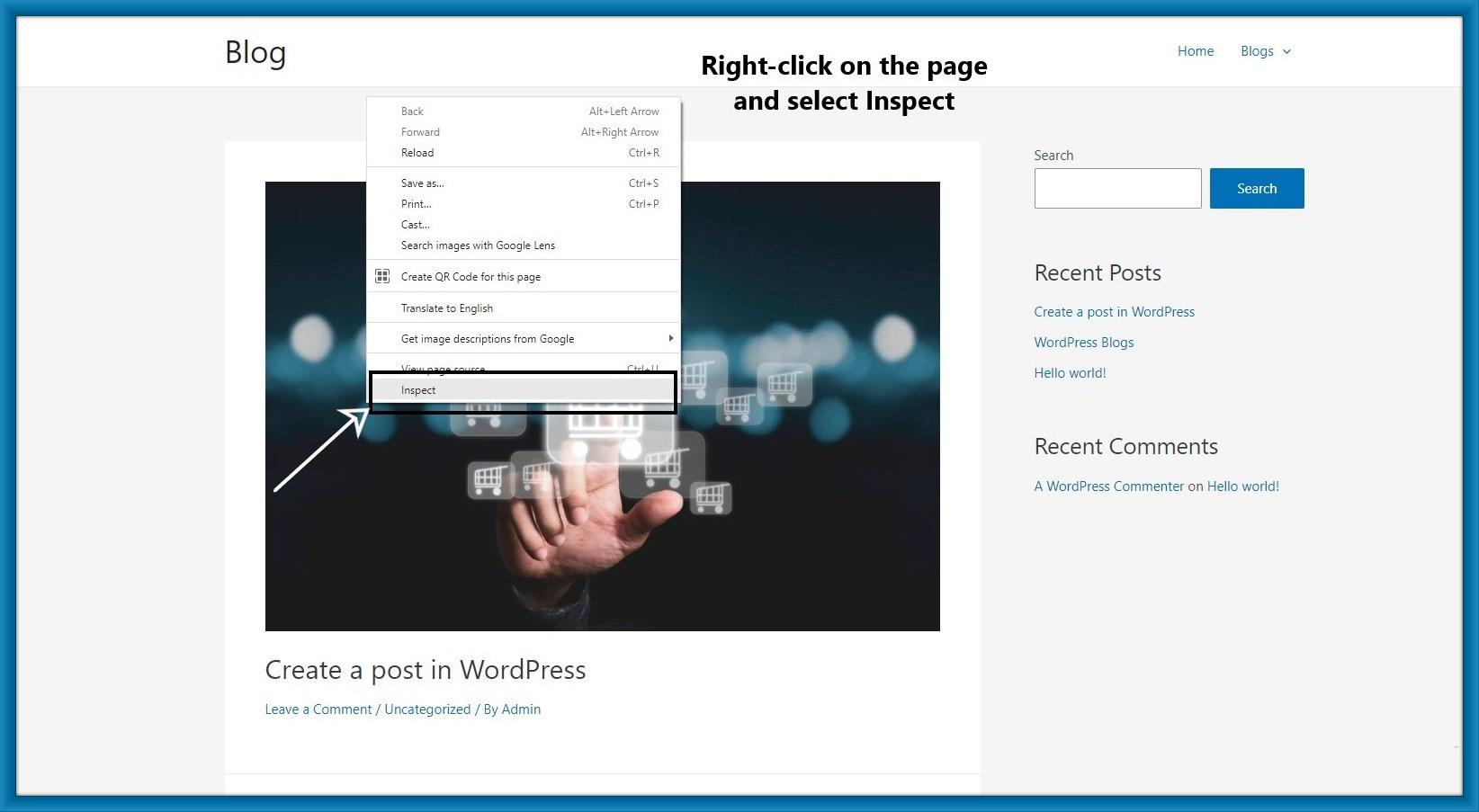
2. Using Google Chrome’s DevTools Device Mode:
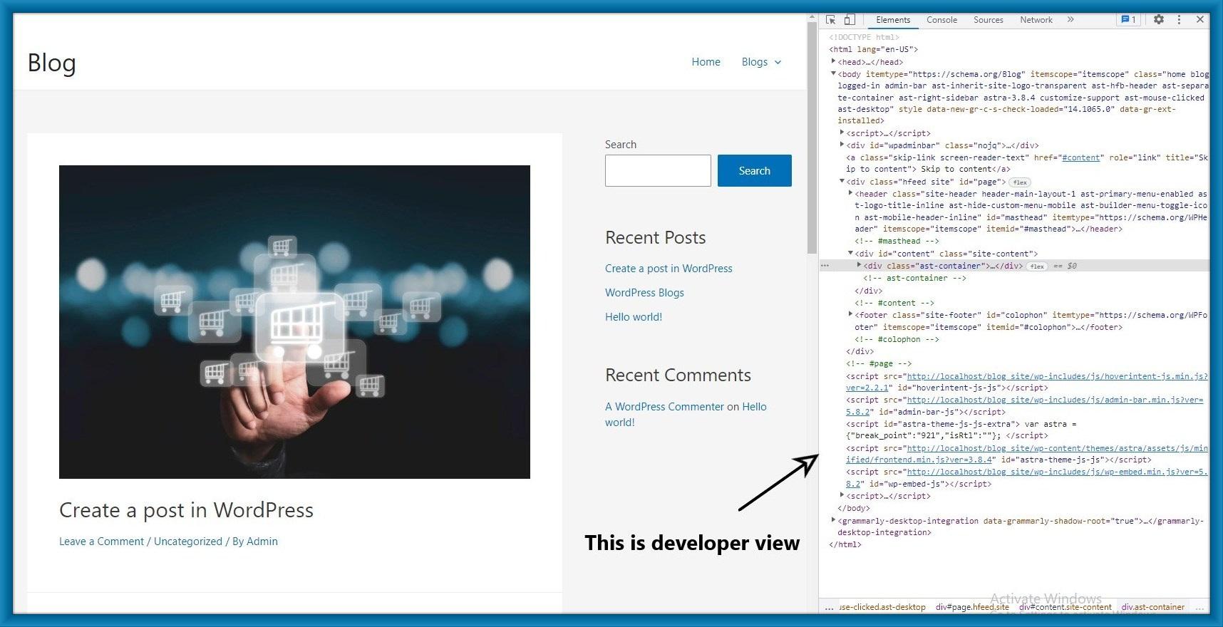
Step 1: Open your site in google chrome and right-click on the page and select inspect.
Step 2: After clicking inspect then will open the developer view on the right-hand side of the page.
Here you can see your site’s HTML source code.
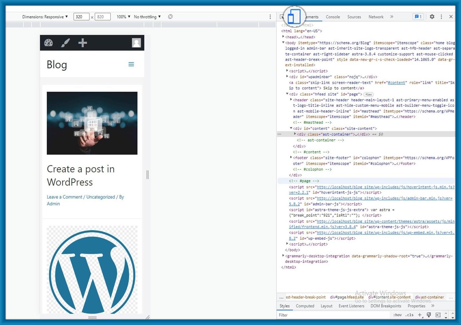
Step 3: Click on the ‘Toggle Device Toolbar’ button to change your site on mobile view.
Step 4: When you run your mouse cursor over the mobile view of your site, it will become a circle.
This circle looks like this.
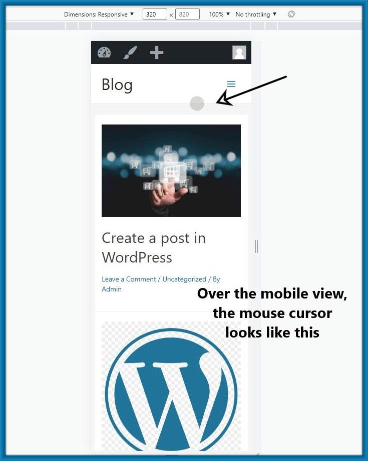
Step 5: Here You can check how your site would look on different types of smartphones.